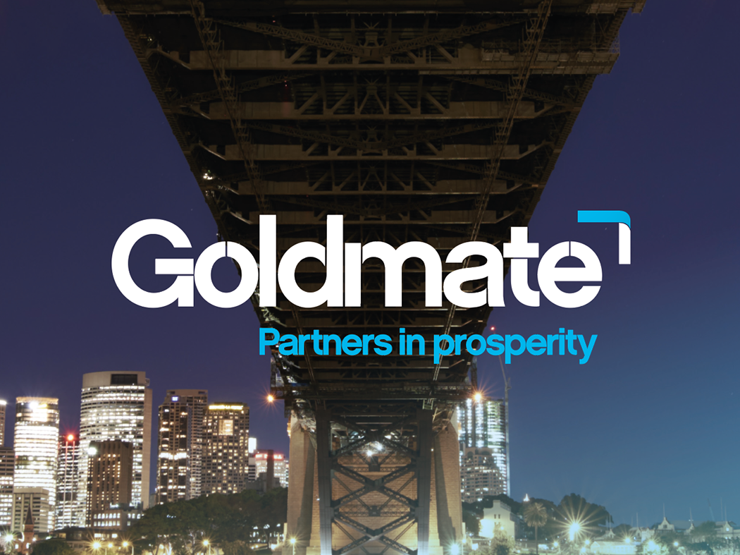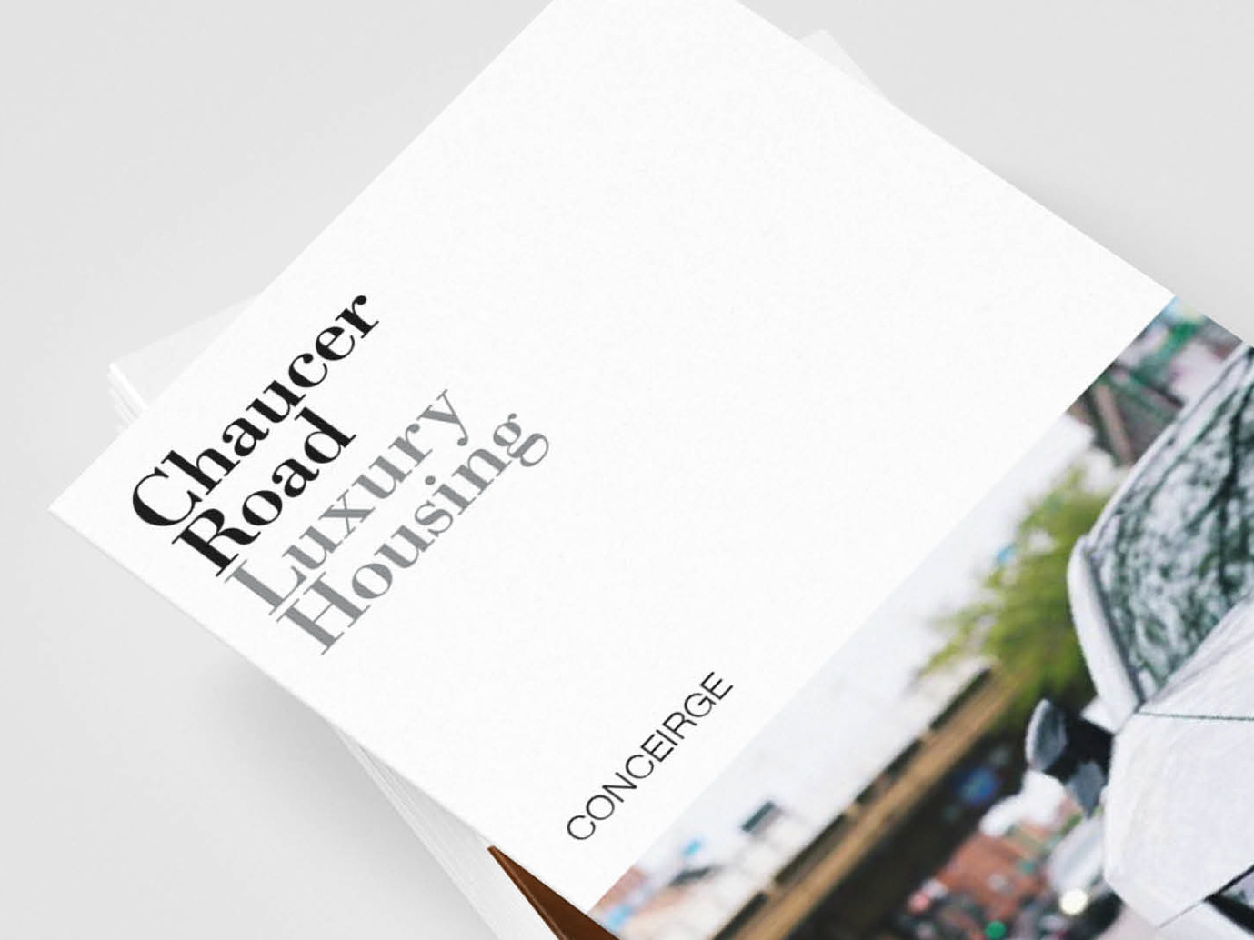
I created a bold, minimal wordmark using two weights to achieve contrast and harmony. The logo was designed to move and stack in different formations, allowing flexibility across layouts – from large-scale event screens to EP covers.
Direct Client.